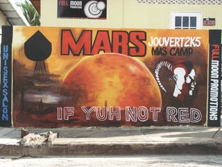
A wall mural depicting a Mar landing of some sort, St. James, Trinidad and Tobago.
You do not have to look very far around the streets of Trinidad to see things that seem a bit unusual in terms of eclectic choices. You may shake your head and wonder what exactly possessed the purchaser to go for that combination of elements! What was in the thoughts of the sign painter? Who agreed to the choice of colours? Did anyone consult an architect and most of all, is this serious or is it a joke?
Welcome to Trinidad kitsch. thebookmann and I had a conversation with a doctor a number of years ago, who was telling us about his attempt to buy a present for a friend who lived in Canada. He told us that he ended up at a hardware store, struck by the show window. He did not intend to go in, but the window just compelled him. What was in this show window? Pink toilet seats and accessories hung up like a Christmas tree. He could not believe his eyes. He probably wondered whether as I stated before, people were being serious. 
Cone-Head
Before I go on, I must state one of my favourite kitschy signage from Port-of-Spain. “ Stationary and Lingerie Shop” Now that is the essence of what kitsch is all about. Kitsch began as an art style in the twentieth century, coined by Germans to describe popular objects like books, magazines, posters, illustration, advertising, comics and pulp fiction. It defined in many ways the Industrial revolution, and represented affordability of the masses to consume products. Kitsch actually has deep, serious social underpinnings, however today, Kitsch is art poking fun at itself. It is basically saying that there is beauty in the absurd, but it is clearly absurd, as well as amusing. With all things for mass consumption, it is inevitable that things fall in and out of favour, and so they can easily become kitsch.
This sign was made for a Carnival band. It is quite elaborate, and clearly the artist must have spent quite some time on the mixing of colours to get the planet Mars just right. The typography choice and the placement of the elements make the billboard unusual. I have no idea whether the artist intended the head of the person on the far right to be a Martian or just an exotic looking man? That shadow is it a space craft? The billboard taken as a whole is quite sincere, and sincerity is another ingredient of what is kitsch. -Adele
As thebookmann remembers thebookmann website and "Public Art"
thebookmannTrinidad Carnival WallPainting Mars Adele Todd thebookmann
Saturday, April 08, 2006
Mars: If Yuh Not Red
Subscribe to:
Post Comments (Atom)
Disclaimer:
Views expressed on thebookmann are not affiliated with any Art Organizations and an “Art Review” may be open to interpretation as it is an observation at face value.
Amendments to such articles if misleading or with grammatical errors shall be corrected accordingly.
All photographs, Feinin studies, accompanying quotes, articles and visual headers appearing on site are the exclusive property of Richard Bolai © 2004 - 2010 All Rights Reserved.
Any fare use is restricted without written permission
No comments:
Post a Comment