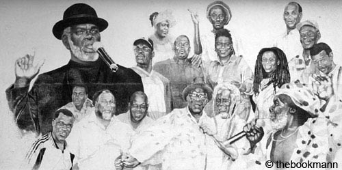
A rare billboard for a calypso tent at the former De Luxe theatre. Port of Spain, 2000 Trinidad, West Indies (Unsigned by the Artist, this billboard no longer exist)
Carnival is not necessarily colour. As imagery for Carnival goes, it is rare to come upon drawing such as this. I was very excited when I saw this large drawing, about 7 feet long by 3 to 3 1/2 feet high. It was produced for a calypso tent that was started at De Luxe theatre. This theatre no longer exists. In its place is a new night-club called Club Zen. The old theatre was one of those rare buildings that featured architecture from the period of Art Deco. What was particularly interesting about this old movie house was the bathrooms. They featured wrought iron details and geometric and floral tiles done in the delicate, quirky semi-restraint of the period. I miss the old place. There are so few symbols of pre World War II architecture, we seem to only save some of the cute ginger bread houses.
This beautiful, life like pencil drawing of calypsonians was rendered with love and respect forall of the musicians involved in that tent. Shadow is drawn the largest and is dressed in his symbolic black, he is sensitively detailed, and is represented on the bottom right of the poster, giving a strong diagonal and framing to the piece.
Whether the artist used photographs of the musicians or drew them from life is unclear, and not a detail that really matters because there is definite skill in the work that is unquestioned. I was surprised when I saw this drawing that it was not treated in any way to suggest value. It was handled like a billboard, and if sprayed or painted over with a binding agent to secure it from fading, it was only just done. It had no adornment to raise it to the level of masterwork, no glass panel over it, no border of wood to claim it. It seemed simply drawn and placed, propped up on the staircase outside the building. Although it was clear that a lot of skill and attention was paid to making it known that it was a good work. After all it was advertising the tent. But it was so by the way, like so much of our best work in Trinidad and Tobago. 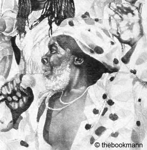
Stalin in a billboard, Port of Spain, 2000 Trinidad, West Indies
The poster was part of a larger banner that held the names of all of the participants in the tent, and that was done in simple Sans Serif text on a green background, separate and apart from the drawing. This drawing to me said less about the whole ‘afro centric’ question (or statement) and more about building up our icons for themselves. It reminded me as well about some paintings I have seen in Chaguanas on the main road. Someone has a group of very realistically rendered portraits of Mas man Peter Minshall among others. By its placement and care, the artist was talking about respect and regard for things Trinidadian. Not for things based on racial coin, and I think that that is where we have to go. There is nothing wrong with racial pride. It is important for self-esteem.
What I am stating is that we live on an island, despite how big we feel, we are very small, and our wealth is within our diversity. Surely we can embrace everything we are, whole, whole, and develop what we know we can become without marginalizing other groups into feeling that only one kind of work is what our country is all about.- Adele
Wednesday, February 22, 2006
Calypso in Art
Subscribe to:
Post Comments (Atom)
No comments:
Post a Comment